Tag: Statehood Quarters

  • Twenty-five cents (part 6)

    Twenty-five cents (part 6)

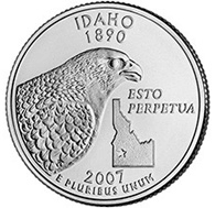
    Wow…I forgot about this series for four months. Whoops! Anyway, time to finish up the whole thing with the last batch of quarters.

    Idaho

    I think I have to be nice here, since my in-laws all live in Idaho, but I don’t care for this quarter. It’s design-by-committee again: the head of an eagle, a state outline, and the motto. Bonus points for the Latin, though.

    Idaho’s quarter: $0.12

    Nevada

    Here’s another quarter where multiple design elements manage to work together. I’d have made the main image clearer, though, by ditching the flowers vining up the sides; the running horses in front of the mountains are fine by themselves.

    Nevada’s quarter: $0.19

    Washington

    This one’s nice, combining a couple of design elements that are themed together. A salmon leaping from the water on its way to spawn, and one of the peaks of Washington’s coastal mountains. I’m not sure if that’s supposed to be a specific mountain – Rainier, maybe? This quarter is nicely done.

    Washington’s quarter: $0.20

    Oregon

    Well…I don’t know. The rendition of Crater Lake is very nice, but it seems to me that the obvious thing for Oregon would have been to depict Lewis and Clark reaching the Pacific at long last, making complete America’s exploration of the continent. I have to rate this quarter, nice as it is, as a giant missed opportunity.

    Oregon’s quarter: $0.17

    California

    I like the idea here of depicting John Muir standing over Yosemite Valley; I just don’t like the picture all that much. Maybe it’s the giant bird flying over everything, but the sense of scale just seems way off to me on this picture, and scale can be done well even on a coin this size (see Nevada above). California has a near miss here.

    California’s quarter: $0.16

    Alaska

    According to the Mint’s website, the final design for Alaska’s quarter was selected by Governor Sarah Palin, so, if that’s the case, maybe the job for her would be to be whoever it is who designs our currency. Hey, I may have my extremely negative opinion of Palin, but credit where due: this is a terrific quarter. What better depiction of Alaska than the rugged brute strength of a grizzly bear?

    Alaska’s quarter: $0.23

    And finally:

    Hawaii

    Ooooh, they came close here, too. I love that they use the native Hawaiian tongue alongside the image of King Kamehameha; I just think the whole coin is thrown off balance by all the blank space needed to show the Islands themselves. They were on to something here, but they didn’t quite get there.

    Hawaii’s quarter: $0.18

    Wrapping up, I’ve greatly enjoyed the unfolding of the Statehood Quarter program over the last ten years. (Geez, has it been that long? yes, it has….) Seeing each new quarter, wondering why each design was chosen, and sifting through every handful of loose change given me have been fun pleasures. So, from this citizen, a big thanks to the US Mint for the Statehood Quarters!

    Share This Post

  • Twenty-five cents (part 5)

    Twenty-five cents (part 5)

    Oops, I seem to have once again gone quite some time without updating this series…I gotta quit spending so much time on Facebook and looking for food-related porn. Anyway, let’s continue rating the Statehood Quarters!

    Kansas

    I can’t be mean about a quarter that features a grazing buffalo. It’s a simple design that works well. (And to be honest, if any state was going to include their motto, I’d have picked Kansas, since I like their motto – As astra per aspera, “To the stars through hardship” – a great deal.

    Kansas’s quarter: $0.19

    South Dakota

    Is the South Dakota quarter the only coin in US history to feature the heads of more than one President? It might be, with Washington on the face, and Mount Rushmore on the reverse. I just wish they’d gone with Mt. Rushmore by itself, and not felt the need to include a bird and the plants rising up the side. Those feel like committee additions.

    South Dakota’s quarter: $0.21

    North Dakota

    I look at this and almost wonder if North Dakota decided to teach Kansas a lesson: “You put a bison on your quarter? Well, we’re gonna put two on ours! Heh!” Still, this is another favorite of mine. I like the sun rising in the background and the rocky form of one of the Badlands there. (However, they could have been perverse and put Marge Gunderson puking in the snow-filled ditch on their quarter…but then, most of the movie’s action takes place in Minnesota, so that probably wouldn’t work.)

    North Dakota’s quarter: $0.22

    Nebraska

    Maybe it’s all those grade school units on the Oregon Trail I had to sit through when we were living in Portland in my youth, but the design of this quarter really makes me think back to those stories of hardship my teachers used to tell us in those studies. This is a wonderful design; I love the stagecoach making its way past Chimney Rock, and the bright, full sun hanging above it all. It’s just a bummer for Nebraska that it’s chiefly known for being a place people have to pass through to get to other places.

    Nebraska’s quarter: $0.23

    Wyoming

    Well…er…well…aww geez, I hate saying this, but…I hate this quarter. With a passion. I can’t believe this is what Wyoming came up with. I look at this quarter and I think, “Really?” We’re talking about a state that has Yellowstone National Park in it, and Devil’s Tower, and the Grand Tetons; instead, they came up with a silhouette of a cowboy ridin’ a buckin’ bronco. And not even a picture of the cowboy, just a featureless outline. And what does the cowboy have to do with the inscription (“The Equality State”)? I can’t imagine the creative process that led to this, the most boring quarter in the entire program. Ugh. This is like the work turned in by the kid in the class who would do the exact minimum amount of required work to avoid receiving a Zero on his assignment.

    Wyoming’s quarter: $0.02

    Montana

    The inscription “Big Sky Country”, and some of Montana’s many mountains, rendered small at the bottom of the quarter, in order to leave room for the looming skull of a dead bull! This quarter always makes me laugh a little, which I’m sure isn’t the intended effect. I just find the whole Western motif of dead cow skulls to be a bit funny. I’m not sure that if I was tasked with choosing a design for a quarter honoring one of our country’s largest and most beautiful states, I’d go with the bleached bones of a picked-over carcass.

    Montana’s quarter: $0.13

    Next time we’ll finish up the fifty states. Huzzah!

    Share This Post

  • Twenty-five cents (part 4)

    Twenty-five cents (part 4)

    Continuing my look at each of the Statehood Quarters, we turn our attention to the South and Southwest. Yay!

    Kentucky

    I like what they do here, although I think it would work better as an action picture rather than a staid view of a horse just standing there; plus, the mansion in the background makes the image a little too busy for my tastes. I think a jockey riding a horse on a track might have been a better way to go. The motto, “My Old Kentucky Home”, is presented in quotes, which I find interesting.

    Kentucky’s quarter: $0.18

    Tennessee

    Another of my favorites, honoring Memphis’s jazz scene and Nashville’s importance to country music. It’s a simple design, with three instruments and a music score, and the symmetry is helped by aiming the guitar and fiddle in opposite directions. This is a very nice quarter.

    Tennessee’s quarter: $0.23

    Arkansas

    Here’s a bit of design-by-committee that works OK, but not terrifically well. As usual, too many elements make for too busy a quarter, but at least the design elements are arranged in a way that’s not too confusing. You’ve got a flowing river (the Mississippi, I assume), a waterfowl in flight, some kind of crop, and a diamond in honor of the fact that Arkansas has a diamond mine. As the design-by-committee quarters go, this isn’t too bad, but it could have been better.

    Arkansas’s quarter: $0.17

    Oklahoma

    I have readers from Oklahoma, so let’s end the suspense! It’s terrible.

    Actually, I’m kidding. Oklahoma proves, once again, that simplicity can work wonders. They give a bird (the state bird, actually, the Scissortail Flycatcher) in flight over two flowers (one of which is the state wildflower, called “Indian Blanket”), and that’s it. It’s a beautiful coin.

    Oklahoma’s quarter: $0.21

    Texas

    I’m conflicted about this quarter, which makes sense, since I’m often conflicted about Texas itself. The design here is so blindingly obvious that it makes me almost crazy. The whole “Lone Star” thing is almost a cliché by this point, and I’d have really hoped that Texas would do something different, and yet, that’s what they did: the Lone Star yet again. Yeah, we get it. Lone Star. Texas. Gotcha. And yet, this is a really nicely done design. The state outline is done in textured relief, and the Lone Star is also textured. But the best part of this quarter, for me, is the border, which is done with a lasso rope. So, Texas did something very nice with a really boring Texas trope.

    Texas’s quarter: $0.20

    New Mexico

    This would be almost perfect if they hadn’t marred it with the off-center inscription “Land of Enchantment”. The relief map of New Mexico with the Navajo symbol above it is terrific. I like this quarter a lot. Nicely done, NM!

    New Mexico’s quarter: $0.22

    Arizona

    Another very beautiful design, my only quibble being that it renders a bit hard-to-make out on the actual coin. I really love how much detail they’re able to get onto a coin, though; this is terribly impressive, which makes some of the other quarters look dowdy by comparison. Arizona did well here.

    Arizona’s quarter: $0.21

    Colorado

    Here’s yet another example of a fine quarter whose only downside is the addition of verbiage. The coin already makes clear that we’re looking at Colorado, so why they felt the need to also have the coin say “Colorful Colorado” is beyond me. I like the mountain scene, though.

    Colorado’s quarter: $0.20

    Utah

    This is another of my favorites, even if we now have our third state that’s identified itself as a crossroads; this time we’re at the “Crossroads of the West”. The coin pays tribute to the completion of the intercontinental railroad, with the final railroad spike ready to be driven, and the two locomotives facing opposite directions.

    Utah’s quarter: $0.23

    Next time: the Heartland and the northern Rockies.

    Share This Post

  • Twenty-five cents (part 3)

    Twenty-five cents (part 3)

    Clearly this series of posts isn’t impressing anybody, because nobody has bothered to remind me about it! But anyway, we’ll continue now, picking up with Ohio:

    Ohio

    The first time I looked at Ohio’s quarter, my reaction was, “Huh?” It’s the ever-boring state outline, with a picture of the Wright Brothers’ airplane prototype and a spacesuited astronaut, explained by the helpful motto: “Birthplace of Aviation Pioneers”. The Wright Brothers were born here, that’s obvious, but who’s the astronaut? Was it just John Glenn, or others? So Ohio used its quarter to honor famous people who did their famous things someplace other than Ohio. OK, I guess, if you like that sort of thing. I, however, am underwhelmed. They could have mentioned Cleveland’s place in the history of rock-and-roll, for example. Meh.

    Ohio’s quarter: $0.11

    Indiana

    Another state that proclaims itself a crossroads, but this time, it’s the Crossroads of the entire country. Yup, the quarter reads: “Crossroads of America”. There’s a ring of stars on one side with a larger star in the middle of it for some unknown reason, a boring monotextured state outline, and a Formula One race car honoring the Indy 500. This design just screams out “Mailed in by the committee for designing a quarter the night before the assignment as due”.

    Indiana’s quarter: $0.09

    Illinois

    As much as I love the Great Lakes region of this country, I’ve gotta say, the quarters these states have come up with are all pretty uninspiring, with New York’s being the best of the lot thus far. Here’s Illinois, another committee-designed hodgepodge of elements that had to be included: Illinois has farms and Chicago, and it gave us Abraham Lincoln, and it’s the twenty-first state, and the coin reminds us that we’re in the 21st century now, and let’s not forget the constant state outline. They probably felt they had to get Lincoln on there, since nobody takes the poor penny seriously anymore, but every state has farms and big cities, and the “21st State and century” bit is just goofy.

    Illinois’s quarter: $0.09

    Michigan

    Finally someone in the Great Lakes region gets it right! See, you don’t have to jam your quarter with lots of unrelated stuff. Michigan shows all five Great Lakes, with Michigan itself rendered topographically. Simple and therefore successful.

    Michigan’s quarter: $0.20

    Wisconsin

    Folks, I have nothing against cows, cheese, or corn. But this, along with the banner reading “Forward” (which has nothing to do with the other design elements), just looks slapped together at the last minute, like Indiana’s. At least they didn’t stick an outline of Wisconsin on there…but this quarter isn’t terribly inspiring.

    Wisconsin’s quarter: $0.12

    Minnesota

    I like the scenic picture they used here, the boat on the lake and the duck (although the duck is so big, relative to the boat, that it feels like they crammed two pictures together), and I’d rank this quarter higher if not for the Minnesota outline, which screws up the composition entirely.

    Minnesota’s quarter: $0.15

    Iowa

    On my personal pantheon of states that have been most important to me over the years, Iowa’s probably second, since I went to college there. The state really does take eduction really seriously, and they chose to reflect this on their state quarter, while at the same time honoring favorite son and artist Grant Wood. It’s nicely done.

    Iowa’s quarter: $0.19

    Missouri

    I like the design here a lot: it’s nice and symmetrical, with what I assume is the great Mississippi River with three people rafting past woods on either side, with the Gateway Arch in the distance. Nothing much to critique here.

    Missouri’s quarter: $0.19

    That’s all for now. Next time, we’ll finish the South and move into the Southwest.

    Share This Post

  • Twenty-five cents (part 2)

    Twenty-five cents (part 2)

    I launched this series a month ago, intending to update it every couple of weeks or so; then, intervening events threw it right out of my mind, until now. If anyone’s been waiting for this, sorry! And now, continuing my examination of the Statehood Quarters.

    Virginia

    Here we have a quarter deliberately trying to tie itself in with pop culture, with Virginia riding the coat-tails of Disney’s movie Pocahantas, which had come out seven or eight years earlier. How shameless is that!

    OK, just kidding there. The founding of the Jamestown colony is, obviously, one of the most important events of early American history, and this quarter features a beautiful design of the ships arriving on the shores of what would become Virginia. In practice, I do think that the design is a little too busy for the small surface of the quarter; maybe if they’d only shown two ships instead of three the picture would be clearer. But it was smart of Virginia to tie their quarter to the impending quadricentennial of their state’s founding.

    Virginia’s quarter: $0.20

    West Virginia

    OK, so West Virginia’s not going along the coast, but it seems silly to talk about one Virginia and not the other one, so here’s West Virginia. They went with a depiction of one of that state’s most famous bits of scenery, the New River Gorge with its stunning bridge. There’s not much I have to say about this, except that it’s very well done. This is one of the better quarters in the series. (Although I admit that I’m surprised they didn’t find some way to get Robert Byrd’s name on their quarter, because in West Virginia, Robert Byrd’s name is on everything.)

    West Virginia’s quarter: $0.22

    North Carolina

    Here’s a depiction not of a famous person or scenic locale, but of a very famous event: the first airplane flight at Kitty Hawk. Again, I don’t have much comment on this one. It’s very nice, although the plane, reduced to that small size, ends up looking a bit like a lopsided ladder. Might have been done a little better, but I like the idea a lot.

    North Carolina’s quarter: $0.19

    South Carolina

    Design-by-committee strikes again. South Carolina crams so much stuff onto its quarter that the entire thing’s a mishmash. There’s a state outline, a tree, a bird, a couple of flowers, a motto, and a star in the middle of the state outline demarking the location of the state capital! Too, too much. There’s nothing here to really look at; this is a quarter that one looks at, says “Hmmm, South Carolina”, and then sticks the quarter into the slot along with three others to get a bottle of Pepsi. I don’t like this one.

    South Carolina’s quarter: $0.07

    Georgia

    Here’s more design-by-committee, although it’s better executed than South Carolina’s. Georgia-related plants curling up the edges of the coin, a peach, a boring state outline again, and another motto (“Wisdom, Justice, Moderation”). Again it’s too much, although the motto’s execution is creatively done, as Georgia didn’t just print the motto on the coin but depict it as being printed on a banner draped across the coin. The peach is nice, too, but I think it should have been larger – dominant, even. The big missed opportunity here, though, is that I think the quarter probably should have featured Dr. Martin Luther King Jr.

    Georgia’s quarter: $0.15

    Florida

    I want to like this one, because I like what it’s trying to do…but I don’t think it works very well at all. The quarter tells us that Florida is the “Gateway to Discovery”, so we have a sailing ship approaching a sea shore with a couple of palm trees, and floating above that is the Space Shuttle. The problems are that the seashore looks totally divorced from the sailing ship – are they landing there? sailing by? getting ready to fire cannons? – and that the Shuttle is hanging in space up there, with no context at all of its own. They’d have been better served, with this theme, to ignore the sailing vessel landing entirely (really, lots of places in America were the scene of vessels from Europe making landfall, and Virginia already covered this territory in much better fashion) and just go with the space theme, in which case they shouldn’t depict the Shuttle apparently in orbit or final approach, but launching. A rocket launch would have made a terrific quarter, wouldn’t it? Florida seriously missed the boat on this one.

    Florida’s quarter: $0.10

    Alabama

    Moving along the Gulf Coast now, we’re at Alabama. They’ve got their plants vining up the side of the coin too, but two different plants: a long-leaf pine branch and magnolia, so that’s interesting. But in the middle of it all they’ve got Helen Keller, whose chair is draped with a banner reading “Spirit of Courage”, and in an inspired bit of design, they identify Keller not just with English lettering but with Braille. This quarter is very original. (It also strikes me that Alabama, which is now one of the most conservative states in the country, chose for its quarter to depict a woman who, although most famous for her overcoming her disabilities, was a very vocal figure for the political left in her day.)

    Alabama’s quarter: $0.19

    Mississippi

    There’s no reason to beat around the bush here: Mississippi’s may be the most beautiful of all the state quarters. In fact, scratch that qualifier; this is the most beautiful of the state quarters. Two flowers that render wonderfully in struck metal, and the motto “The Magnolia State” is rendered in a script font as opposed to the block lettering that has dominated the Statehood Quarters. Well, well, well done, Mississippi!

    Mississippi’s quarter: $0.24

    Louisiana

    Here we have two possible design ideas crammed together by committee to the cheapening of each, combined with a third design idea that nobody would have missed had it not been there at all. They should have either honored the Louisiana Purchase by itself, or New Orleans as the birthplace of jazz by itself, but they cram both onto the coin. With a pelican for good measure. Nothing works very well on this quarter, I’m afraid.

    Louisiana’s quarter: $0.08

    There we stop for now. Next time I’ll start with Ohio and proceed westward across the Great Lakes region and the Upper Midwest.

    Share This Post

  • Twenty-five Cents (part one)

    Twenty-five Cents (part one)

    Here’s a lark that seems to me to be exactly why blogs were invented: I’m going to opine on all fifty of the Statehood Quarters! Now that all fifty are in circulation (or at least have had their designs released), it’s time to either praise them or rip them to shreds. The disclaimer here is that when I make fun of a quarter that I think stinks, I’m attacking the quarter. Not the state. The quarter. Just because I may think your state’s quarter is poorly designed doesn’t mean I don’t like your state, or you. (Of course, the reverse also applies, but let’s not discuss that.)

    We’ll do this over a series of posts, to keep the length down. I’m indebted to the US Mint website for the images of the quarters themselves, as well as occasional bits of background info on the designs themselves. Each quarter will be ranked, logically enough since we’re dealing with quarters, on a scale of one to twenty-five cents. Let’s begin, shall we? Starting in the northeast, with New England and the Middle Atlantic states!

    Maine

    OK, right off the bat, we hit one of my favorite designs. I prefer the quarters that take the limited amount of space they had to work with (less than an inch in diameter) and depict an actual scene. They’ve got a masted yacht sailing out there in the Atlantic, past a lighthouse. They could have gone lazy here and just had the lighthouse, or the yacht, but what makes the quarter for me isn’t just that they got both, but they got the rocky slope from which the lighthouse rises, finely textured, right down to the large fallen rocks sitting partially submerged at the edge of the sea. I also like the sea birds in flight, the pine tree off to the side of the lighthouse lot, and the picket fence surrounding the lighthouse property. The quarter doesn’t just convey that Maine’s got lots of seashore, but the character of that seashore. This one’s well done. Bonus points for avoiding words entirely.

    Maine’s quarter: $0.23

    New Hampshire

    This probably seemed a better idea in a larger picture than as an actual quarter; in the actual size and in actual cold metal, the picture of the Old Man of the Mountain doesn’t come off all that well. Plus, I always found that selection of image odd, anyway: the Old Man of the Mountain didn’t really convey anything about New Hampshire, really, other than the fact that it used to have a rock feature that by pure accident of erosion looked like the profile of a geezer. It also doesn’t have much to do with the inclusion of the state’s motto, “Live Free or Die”. (And I can’t hear that motto anywhere without thinking of George Carlin, who noted, “I don’t want to live anyplace where they mention death right on their license plates.”) And it’s not New Hampshire’s fault at all, but it doesn’t really help that the Old Man of the Mountain collapsed not long after their quarter went into circulation in the first place. So I don’t like this one all that much.

    New Hampshire’s quarter: $0.14

    Vermont

    Here we have a good example of a state designing its quarter to reflect what that state’s generally known for these days: Vermont’s got a guy tapping maple trees for sap. Nothing wrong with that, as far as I’m concerned; I’m a big maple fan. I like this quarter quite a bit, actually. It’s a little quirky, kind of like Vermont itself; this quarter doesn’t take itself terribly seriously and it lays its claim to Vermont’s justifiable pride in its maple industry. I do think that the mountain in the background muddies the design a bit, drawing the eye away from the symmetrical central scene, and I don’t know why the motto “Freedom and Unity” needed to be there at all.

    Vermont’s quarter: $0.20

    Massachusetts

    Here’s the first of our series that doesn’t do much for me at all. It just reeks of design-by-committee, as many of the statehood quarters do. They really would have been much better served in coming up with something more evocative of the Revolutionary War theme than just having a generic Colonial soldier standing in front of a generic outline of Massachusetts itself. And the words “The Bay State” add nothing. You can hear the design committee saying, in effect, “OK, we’re the Bay State and we had the Revolution. We gotta get both of those on there.” Meh.

    Massachusetts’s quarter: $0.12

    Rhode Island

    This quarter works pretty well. It doesn’t excite me all that much, but it does tie the motto in with the illustration, which Massachusetts didn’t even try to do. The Ocean State shows us the ocean! And apparently Rhode Island has a really big suspension bridge somewhere. The water’s nice and choppy, but they could have thrown in some birds or something else. Anyway, this is OK.

    Rhode Island’s quarter: $0.18

    Connecticut

    Maybe I should have started this series on the West and moved my way eastward, which would have put the Connecticut quarter in the final post of this series instead of the first one. I say this because Connecticut’s quarter is my favorite of the entire series. I just love this quarter, and I remember when I first saw it when it was issued, I thought something along the lines of “Wow, forty-some states are going to have a hard time topping this.” And, in my opinion, none did. Connecticut doesn’t include a state motto or anything like that; instead, they give a wonderfully rendered picture of a venerable oak tree, a picture whose circular nature beautifully fills up much of the quarter, along with the grassy field that tree stands in and the stone fence beyond it. They nicely identify this specific tree as “The Charter Oak”. And as an added bonus, I’ll bet very few people who don’t live in Connecticut know what the Charter Oak was, so this quarter invites further exploration of the state’s history. Great quarter.

    Connecticut’s quarter: $0.25

    New York

    Again with design-by-committee; you just know that somebody was in that room insisting that no possible New York State quarter could exist without depicting the Statue of Liberty, so there she is. Maybe there’s a point there, but leaving Lady Liberty off the quarter and just having that picture of New York State with the motto “Gateway to Freedom” would have worked nicely. I’m not, as we’ll see thoughout this exercise, a big fan of pictures of states and their outlines, but this one’s interesting on two levels: first, when you contrast this with, say, Massachusetts above, you see that New York doesn’t just show the state outline, but rather a topographical relief map of the state, which I find a fascinating choice. Second, the map ties in with the “Gateway to Freedom” motto by showing the line of the Erie Canal. Plus, this is my home state’s quarter, so I’m a bit biased on that regard as well.

    New York’s quarter: $0.20

    Pennsylvania

    More design-by-committee afflicts this one, and it’s one of my least favorites. At least Massachusetts gave its state outline some texture; Pennsylvania just gives the outline with no features within. Boring. They stick a little keystone in there (because it’s the Keystone State), they have a statue from Philadelphia, and the motto “Virtue Liberty Independence”. It’s a design that accomplishes the fascinating feat of being (a) too busy, and (b) too lax with the space they had to work with. I really don’t like this one much at all.

    Pennsylvania’s quarter: $0.08

    New Jersey

    There’s really something romantic about the notion of a crossroads, isn’t there? Several states use their quarters to pronounce themselves the “Crossroads” of something or other. New Jersey declares itself the “Crossroads of the Revolution”, whatever that means…did General Washington get there with his army and then look at the signpost and say, “OK, fellas, do we turn left and take New York, or do we swing right and head down toward Delaware? Guys? Guys! Hey, it’s not my fault the winter sucked!” But joking aside, the picture of Washington crossing the Delaware is, of course, one of the iconic images of American history, and double kudos to New Jersey for going with that image and not fouling it up with a state outline of Jersey itself. They could have ditched the motto here, but that’s a small quibble. This is an excellent quarter.

    New Jersey’s quarter: $0.23

    Delaware

    Don’t you forget it, folks: Delaware’s the First State. Until someone else came along, the United States was really the United State, and that state was Delaware. Since the quarters were issued in the order of the states’ admission to the Union, this was the first quarter to come out. I first saw it when I was doing a nightly cash count at the restaurant I was managing at the time, and since I’d heard nothing of the Statehood Quarters initiative, I didn’t even know if the coin was real or not! (This was when the Internet was not yet the repository of rock-solid, reliable information that it is now, and when 56K modems were exotic things that only rich folks had.) So I set the quarter aside and didn’t include it in our nightly deposit. Funny, that. But the quarter itself? It’s got some nice design there, I think; it conveys action by having its American Revolution figure riding (as opposed to just standing there waiting for the Redcoats to shoot him, like the guy on the Massachusetts quarter). I’m not thrilled about “The First State” being on there; doesn’t this make Delaware the “First Poster” of the statehood quarter initiative? And who is Caesar Rodney, anyway? Well, he was a delegate from Dover who rode all the way to Philadelphia to cast the deciding vote for Independence. Another quarter inspires further research!

    Delaware’s quarter: $0.21

    Maryland

    Meh. Maryland’s the Old Line State, and they’ve got an old building somewhere with a nifty looking dome. And they grow some kind of plant there, so that plant’s on the quarter, curling up the sides. Not much to say here; this is a really boring quarter. Surely the state of Chesapeake Bay and of Edgar Allan Poe could have come up with something more interesting than this. How about a crab fisherman? Or just a raven with the word “Nevermore”? That would have been cool. An old building, a motto, and a plant? Not so much.

    Maryland’s quarter: $0.09

    (Here I’ll note that I think that Washington, DC should be a state.)

    That’s where I’ll stop now. Next time we’ll continue moving southward, toward the Gulf of Mexico.

    Share This Post