Here’s a lark that seems to me to be exactly why blogs were invented: I’m going to opine on all fifty of the Statehood Quarters! Now that all fifty are in circulation (or at least have had their designs released), it’s time to either praise them or rip them to shreds. The disclaimer here is that when I make fun of a quarter that I think stinks, I’m attacking the quarter. Not the state. The quarter. Just because I may think your state’s quarter is poorly designed doesn’t mean I don’t like your state, or you. (Of course, the reverse also applies, but let’s not discuss that.)
We’ll do this over a series of posts, to keep the length down. I’m indebted to the US Mint website for the images of the quarters themselves, as well as occasional bits of background info on the designs themselves. Each quarter will be ranked, logically enough since we’re dealing with quarters, on a scale of one to twenty-five cents. Let’s begin, shall we? Starting in the northeast, with New England and the Middle Atlantic states!

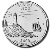
OK, right off the bat, we hit one of my favorite designs. I prefer the quarters that take the limited amount of space they had to work with (less than an inch in diameter) and depict an actual scene. They’ve got a masted yacht sailing out there in the Atlantic, past a lighthouse. They could have gone lazy here and just had the lighthouse, or the yacht, but what makes the quarter for me isn’t just that they got both, but they got the rocky slope from which the lighthouse rises, finely textured, right down to the large fallen rocks sitting partially submerged at the edge of the sea. I also like the sea birds in flight, the pine tree off to the side of the lighthouse lot, and the picket fence surrounding the lighthouse property. The quarter doesn’t just convey that Maine’s got lots of seashore, but the character of that seashore. This one’s well done. Bonus points for avoiding words entirely.
Maine’s quarter: $0.23

This probably seemed a better idea in a larger picture than as an actual quarter; in the actual size and in actual cold metal, the picture of the Old Man of the Mountain doesn’t come off all that well. Plus, I always found that selection of image odd, anyway: the Old Man of the Mountain didn’t really convey anything about New Hampshire, really, other than the fact that it used to have a rock feature that by pure accident of erosion looked like the profile of a geezer. It also doesn’t have much to do with the inclusion of the state’s motto, “Live Free or Die”. (And I can’t hear that motto anywhere without thinking of George Carlin, who noted, “I don’t want to live anyplace where they mention death right on their license plates.”) And it’s not New Hampshire’s fault at all, but it doesn’t really help that the Old Man of the Mountain collapsed not long after their quarter went into circulation in the first place. So I don’t like this one all that much.
New Hampshire’s quarter: $0.14

Here we have a good example of a state designing its quarter to reflect what that state’s generally known for these days: Vermont’s got a guy tapping maple trees for sap. Nothing wrong with that, as far as I’m concerned; I’m a big maple fan. I like this quarter quite a bit, actually. It’s a little quirky, kind of like Vermont itself; this quarter doesn’t take itself terribly seriously and it lays its claim to Vermont’s justifiable pride in its maple industry. I do think that the mountain in the background muddies the design a bit, drawing the eye away from the symmetrical central scene, and I don’t know why the motto “Freedom and Unity” needed to be there at all.
Vermont’s quarter: $0.20

Here’s the first of our series that doesn’t do much for me at all. It just reeks of design-by-committee, as many of the statehood quarters do. They really would have been much better served in coming up with something more evocative of the Revolutionary War theme than just having a generic Colonial soldier standing in front of a generic outline of Massachusetts itself. And the words “The Bay State” add nothing. You can hear the design committee saying, in effect, “OK, we’re the Bay State and we had the Revolution. We gotta get both of those on there.” Meh.
Massachusetts’s quarter: $0.12

This quarter works pretty well. It doesn’t excite me all that much, but it does tie the motto in with the illustration, which Massachusetts didn’t even try to do. The Ocean State shows us the ocean! And apparently Rhode Island has a really big suspension bridge somewhere. The water’s nice and choppy, but they could have thrown in some birds or something else. Anyway, this is OK.
Rhode Island’s quarter: $0.18

Maybe I should have started this series on the West and moved my way eastward, which would have put the Connecticut quarter in the final post of this series instead of the first one. I say this because Connecticut’s quarter is my favorite of the entire series. I just love this quarter, and I remember when I first saw it when it was issued, I thought something along the lines of “Wow, forty-some states are going to have a hard time topping this.” And, in my opinion, none did. Connecticut doesn’t include a state motto or anything like that; instead, they give a wonderfully rendered picture of a venerable oak tree, a picture whose circular nature beautifully fills up much of the quarter, along with the grassy field that tree stands in and the stone fence beyond it. They nicely identify this specific tree as “The Charter Oak”. And as an added bonus, I’ll bet very few people who don’t live in Connecticut know what the Charter Oak was, so this quarter invites further exploration of the state’s history. Great quarter.
Connecticut’s quarter: $0.25

Again with design-by-committee; you just know that somebody was in that room insisting that no possible New York State quarter could exist without depicting the Statue of Liberty, so there she is. Maybe there’s a point there, but leaving Lady Liberty off the quarter and just having that picture of New York State with the motto “Gateway to Freedom” would have worked nicely. I’m not, as we’ll see thoughout this exercise, a big fan of pictures of states and their outlines, but this one’s interesting on two levels: first, when you contrast this with, say, Massachusetts above, you see that New York doesn’t just show the state outline, but rather a topographical relief map of the state, which I find a fascinating choice. Second, the map ties in with the “Gateway to Freedom” motto by showing the line of the Erie Canal. Plus, this is my home state’s quarter, so I’m a bit biased on that regard as well.
New York’s quarter: $0.20

More design-by-committee afflicts this one, and it’s one of my least favorites. At least Massachusetts gave its state outline some texture; Pennsylvania just gives the outline with no features within. Boring. They stick a little keystone in there (because it’s the Keystone State), they have a statue from Philadelphia, and the motto “Virtue Liberty Independence”. It’s a design that accomplishes the fascinating feat of being (a) too busy, and (b) too lax with the space they had to work with. I really don’t like this one much at all.
Pennsylvania’s quarter: $0.08

There’s really something romantic about the notion of a crossroads, isn’t there? Several states use their quarters to pronounce themselves the “Crossroads” of something or other. New Jersey declares itself the “Crossroads of the Revolution”, whatever that means…did General Washington get there with his army and then look at the signpost and say, “OK, fellas, do we turn left and take New York, or do we swing right and head down toward Delaware? Guys? Guys! Hey, it’s not my fault the winter sucked!” But joking aside, the picture of Washington crossing the Delaware is, of course, one of the iconic images of American history, and double kudos to New Jersey for going with that image and not fouling it up with a state outline of Jersey itself. They could have ditched the motto here, but that’s a small quibble. This is an excellent quarter.
New Jersey’s quarter: $0.23

Don’t you forget it, folks: Delaware’s the First State. Until someone else came along, the United States was really the United State, and that state was Delaware. Since the quarters were issued in the order of the states’ admission to the Union, this was the first quarter to come out. I first saw it when I was doing a nightly cash count at the restaurant I was managing at the time, and since I’d heard nothing of the Statehood Quarters initiative, I didn’t even know if the coin was real or not! (This was when the Internet was not yet the repository of rock-solid, reliable information that it is now, and when 56K modems were exotic things that only rich folks had.) So I set the quarter aside and didn’t include it in our nightly deposit. Funny, that. But the quarter itself? It’s got some nice design there, I think; it conveys action by having its American Revolution figure riding (as opposed to just standing there waiting for the Redcoats to shoot him, like the guy on the Massachusetts quarter). I’m not thrilled about “The First State” being on there; doesn’t this make Delaware the “First Poster” of the statehood quarter initiative? And who is Caesar Rodney, anyway? Well, he was a delegate from Dover who rode all the way to Philadelphia to cast the deciding vote for Independence. Another quarter inspires further research!
Delaware’s quarter: $0.21

Meh. Maryland’s the Old Line State, and they’ve got an old building somewhere with a nifty looking dome. And they grow some kind of plant there, so that plant’s on the quarter, curling up the sides. Not much to say here; this is a really boring quarter. Surely the state of Chesapeake Bay and of Edgar Allan Poe could have come up with something more interesting than this. How about a crab fisherman? Or just a raven with the word “Nevermore”? That would have been cool. An old building, a motto, and a plant? Not so much.
Maryland’s quarter: $0.09
(Here I’ll note that I think that Washington, DC should be a state.)
That’s where I’ll stop now. Next time we’ll continue moving southward, toward the Gulf of Mexico.
Share This Post
Discover more from ForgottenStars.net
Subscribe to get the latest posts sent to your email.
I actually sort of like the Maryland quarter. It looks classic. I mostly agree with you on the others. In this group my favorite is Maine.
This is going to be interesting. I can hardly wait until you get to Oklahoma. I will hold my opinions on that quarter until you post yours.
there will be a DC quarter in 2009.
http://www.statequarterguide.com/2009-dc-us-territories-quarter-program/
In general it is safe to say that the more imagery the designers try to cram in, the worse the quarter looks. Pick one thing, and if you feel you have to, superimpose over an outline map of the state. The best ones don’t bother with the map at all. The worst– South Carolina, Tennessee and Louisiana come to mind– are a confusing mismosh. It’s surprising how many states just blew it, and it is surprising which ones. Take South Carolina, for example. Not a state I like particularly, but it has that great looking Palmetto Tree and crescent moon state flag. Go with that, South Carolina! You can’t think Tennessee without thinking of music, so how about the stage of the Grand Old Opry, filled with musicians?
The other problem with many of these coins is that they settled on an image that has so little to do with the state that the point is lost. Ohio is like this. Sorry, Buckeyes, North Carolina gets “First in Flight” and your connection to astronauts is too attenuated. You should have had the Ohio State marching band dotting the “i”.
I could go on, but it’s your project, so I won’t.